When it comes to designing a workspace that truly works, aesthetics aren’t just about style — they can influence performance, mood, and wellbeing. One of the most powerful yet often overlooked elements is colour. Colour psychology explores how different hues affect human behaviour and emotions, and when applied thoughtfully, it can transform how people feel and function in a workplace.
In this article, we’ll explore the science and strategy behind using colour in workplace design and how businesses can leverage it to foster productivity, creativity, and mental wellness. For a complementary guide, see our related article: The Perfect Office Colour Palette.
Why Colour Matters in Office Environments
From the calming blues of healthcare settings to the energising reds seen in creative agencies, colour has long been used in interiors to set the tone. In the workplace, colour has a measurable impact on motivation, concentration, and even employee retention.
Choosing the right palette isn’t about personal taste alone — it’s about creating an environment that supports how your people think, feel, and work. And in an era of hybrid working and wellbeing-led design, these details matter more than ever.
The Psychological Effects of Common Colours
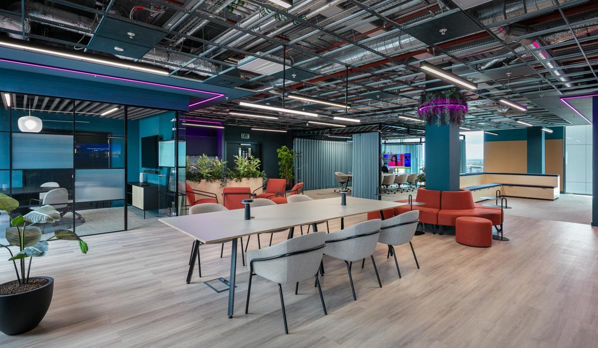
Blue: Focus and Calm
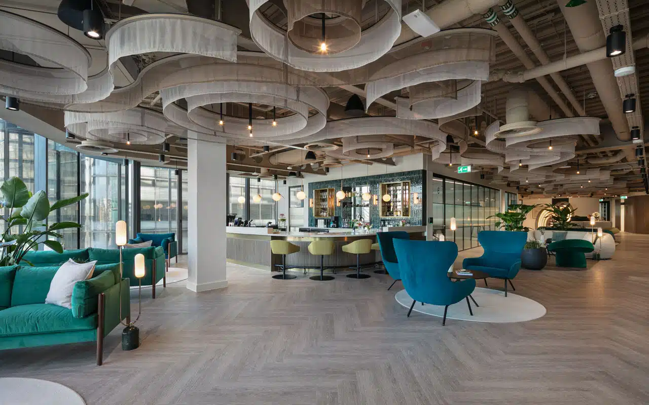
Green: Balance and Wellbeing
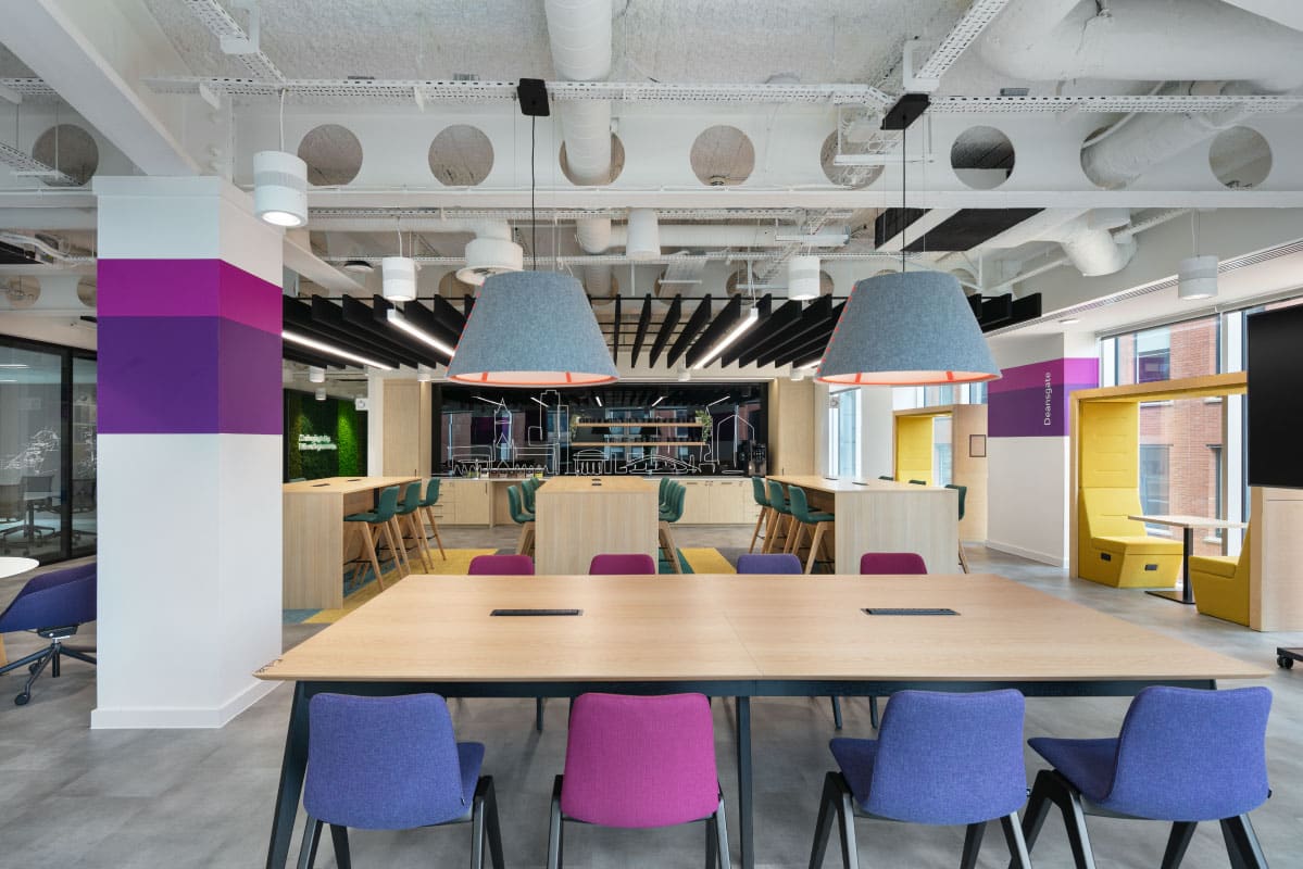
Yellow: Optimism and Creativity
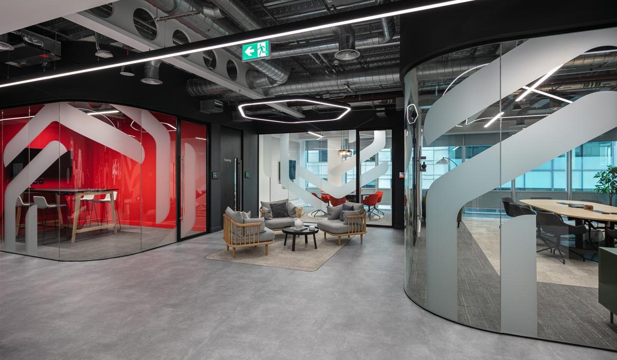
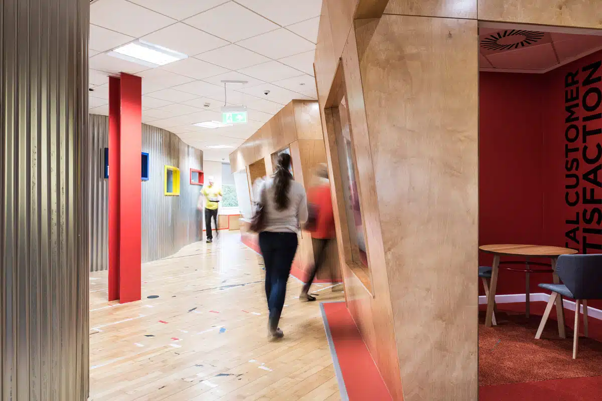
Red: Energy and Urgency
Neutrals: Versatility and Sophistication
Designing with Purpose: Colour by Zone
Incorporating colour psychology into office design means applying different hues based on function and mood. Here’s how to approach this:
- Reception and Welcome Areas: Use inviting and confident colours like warm neutrals, teal, or navy to set a positive tone and reflect your brand identity.
- Focus Zones: Cooler colours such as blues and greens enhance concentration and calm.
- Collaboration Areas: Energising tones like yellow or soft orange can encourage communication and creative thinking.
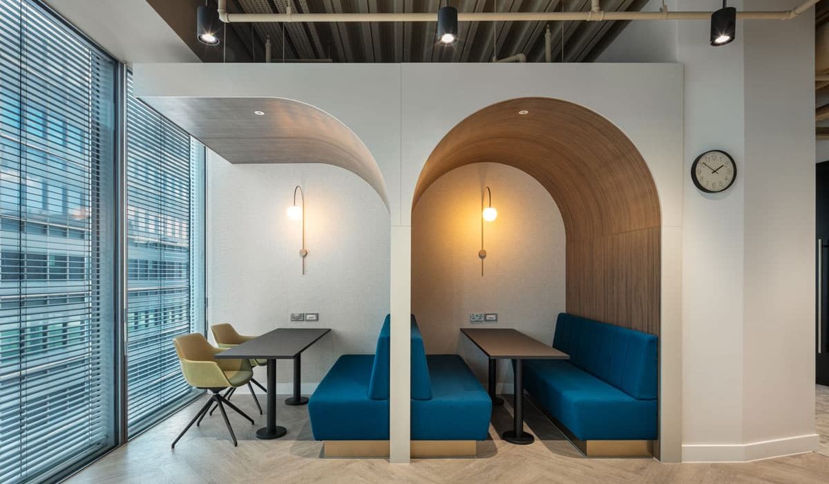
- Breakout and Wellness Spaces: Greens, earthy tones, and natural materials help support relaxation and mindfulness.
Linking Colour to Culture and Brand
Colour doesn’t just influence mood — it reflects your company culture and values. When chosen carefully, your colour palette can reinforce your brand identity internally and externally. For instance, a tech startup might lean on bold, playful shades to reflect innovation, while a law firm may favour deeper, more traditional tones to signal trust and stability.
It’s also worth considering cultural interpretations of colour, especially for global organisations, as colour meanings can differ between regions.
Tips for Getting it Right
To implement colour psychology effectively:
- Use natural light to your advantage – colours appear differently under various lighting conditions.
- Balance bold tones with neutrals – too much colour can overwhelm the senses.
- Test before committing – paint samples or digital renders can help visualise the final look.
- Involve your people – employee feedback ensures the space feels inclusive and supportive.
Final Thoughts
Colour plays a vital role in how people feel, think, and perform at work. When aligned with your workplace strategy, colours can go far beyond decoration — they become tools for motivation, mental health, and performance.
At ADT Workplace, we help businesses craft spaces that reflect their values and inspire their teams. From design consultancy to full fit-outs, our team brings together science and creativity to build people-first work environments.

