Introduction
Colour is a powerful yet often overlooked element of office design. The right office colour palette can dramatically influence employee mood, productivity, and creativity. By understanding the psychology of colour and matching it to workplace functions, businesses can create inspiring workspaces that enhance well-being and reflect brand identity.
In this article, we’ll discuss the impact of colours on mood and productivity, how to match them to office spaces, and tips for creating a balanced and harmonious office environment.
The Psychology of Colour
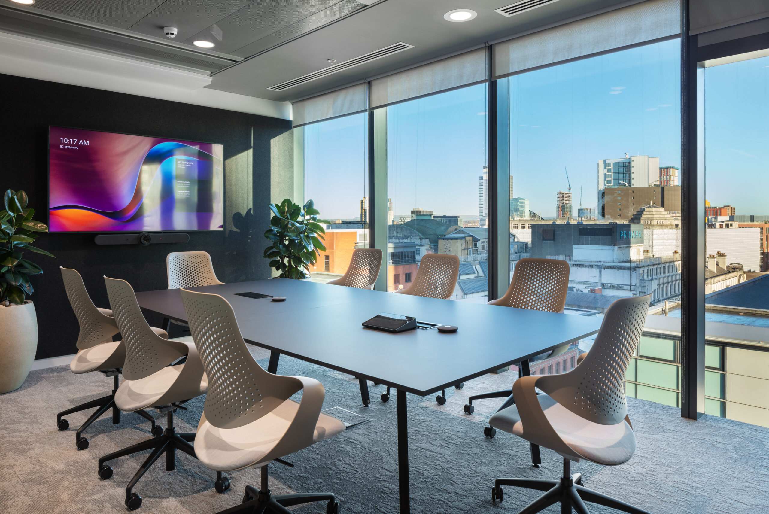
Blue: Promotes calm, focus, and concentration—perfect for areas requiring deep work like private offices and meeting rooms.
Green: Reduces stress and inspires balance, creativity, and focus. Ideal for collaborative zones, brainstorming areas, and break spaces.
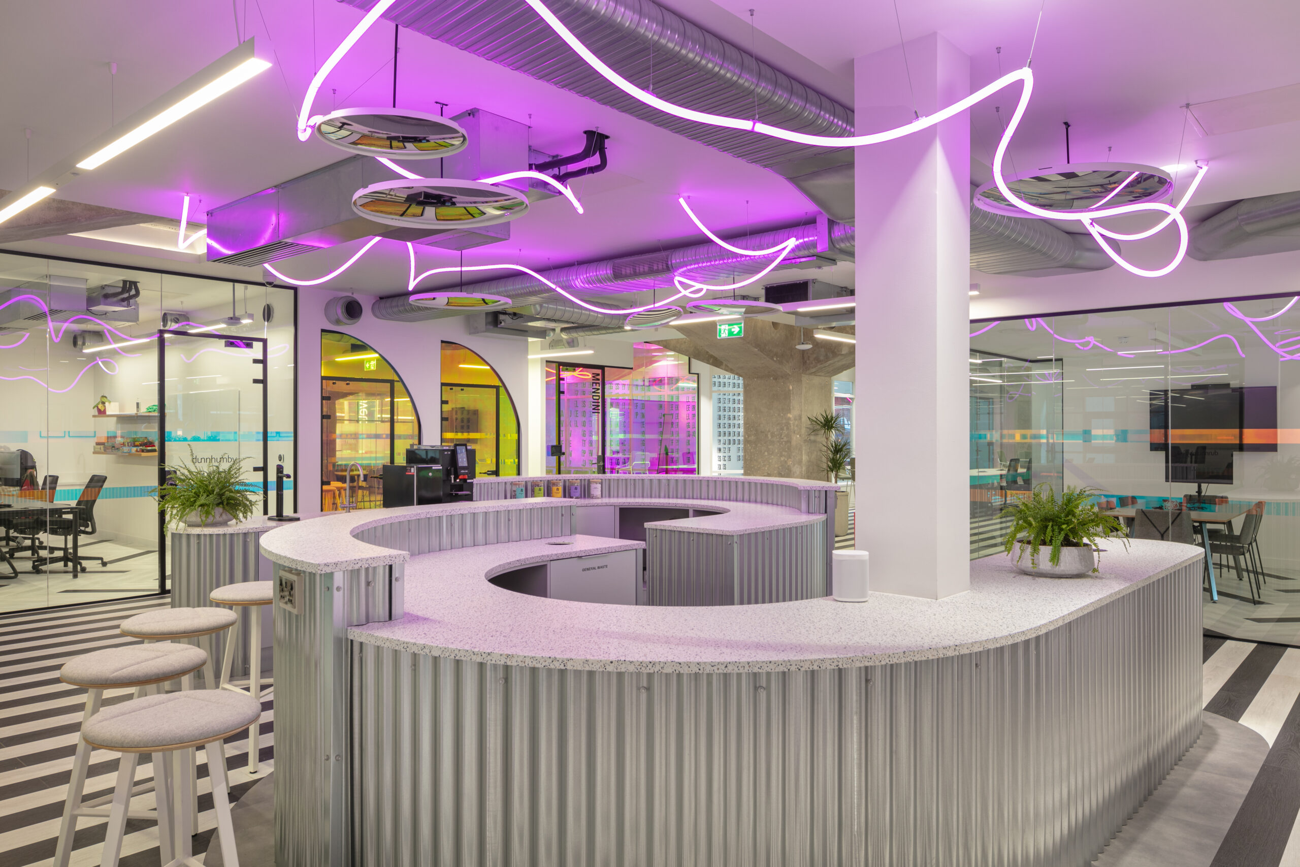
Yellow: Represents energy, optimism, and creativity. Best suited for sparking ideas in innovation hubs but should be used sparingly to avoid overstimulation.
Red: Evokes urgency, excitement, and energy, making it suitable for breakout zones or fitness areas.
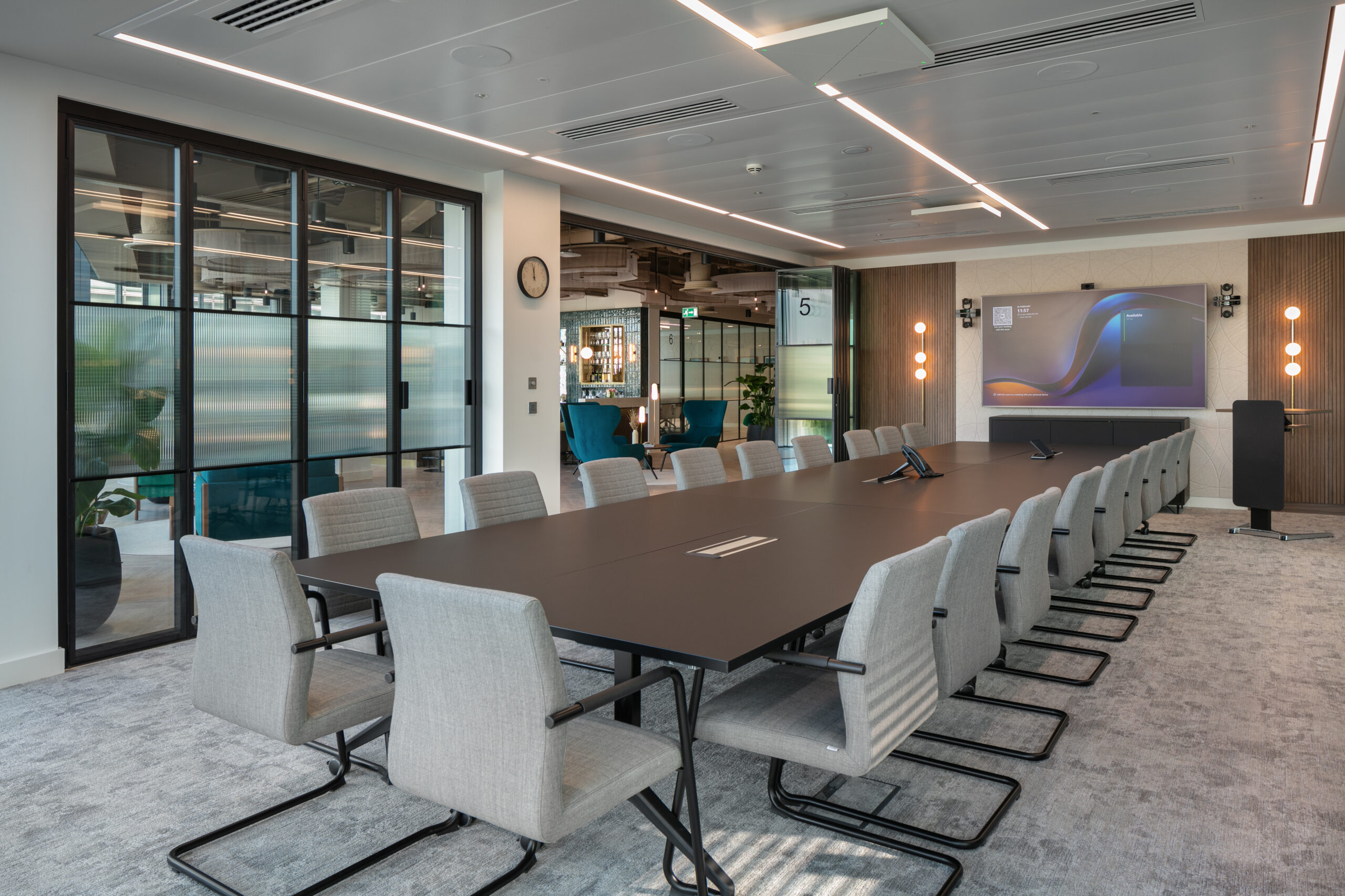
Neutrals: Timeless tones like beige, grey, and white create a professional foundation, especially in client-facing spaces. These can be paired with bold accent colours to reflect personality.
Takeaway: Use colours strategically to influence emotional responses and support the tasks performed in each area.

Matching Colour to Workplace Function
Focus Zones: Use calming blues, greys, or muted greens to promote concentration and limit distractions.
Collaborative Spaces: Vibrant yellows, oranges, or energising reds stimulate creativity and group engagement.
Breakout Areas: Relaxing greens and warm neutrals offer employees a stress-free environment to unwind and recharge.
Client-Facing Areas: Neutral palettes accented with brand colours create a professional and trustworthy impression.
Aligning colours with function ensures employees feel supported, motivated, and engaged throughout their workday.
The Role of Brand Identity and Culture
The office colour palette is an opportunity to reinforce your brand identity and company culture. Integrating brand colours into the design can inspire loyalty among employees and create memorable first impressions for visitors.
Reinforce Core Values: Use colours that align with your organisation’s ethos—eco-conscious greens for sustainability, professional neutrals for reliability, or bold yellows for creativity.
Create a Unified Look: Incorporate brand colours into feature walls, furniture, and décor to ensure a cohesive and professional design.
Example: A creative agency might incorporate bold, dynamic colours to reflect innovation, while a corporate firm may use subtle neutral tones to project stability.
Lighting and Colour Perception
Natural Light: Amplifies lighter tones, enhancing pastels and neutrals, and creates a bright, uplifting atmosphere.
Artificial Light: Fluorescent and LED lighting can distort colours. Warm light pairs well with earthy tones, while cooler lighting complements blues and greys.
Layered Lighting: Combine ambient, task, and accent lighting to maintain consistency in your colour scheme throughout the day.
Tip: Always test colours under both natural and artificial lighting to avoid unexpected shifts in tone.
Practical Tips for Choosing the Perfect Palette
- Start with a Neutral Base: Use timeless neutrals like white, beige, or grey and layer in bold accent colours for personality.
- Consider Functionality: Match colours to the purpose of each area—calm tones for focus zones and energising hues for collaborative spaces.
- Incorporate Biophilic Design: Integrate natural greens and wood elements to promote well-being and connect employees to nature.
- Experiment with Accents: Add small pops of colour through décor, artwork, and furniture to liven up the space without overwhelming it.
- Test Before Finalising: Use swatches, mock-ups, or virtual tools to visualise how colours interact with lighting and layout.
Case Studies: How Colour Transforms Workplaces
Creative Office Spaces: Incorporating energising yellows alongside calming greens to inspire collaboration and focus.
Professional Work Environments: Using neutral foundations with subtle brand colours to reinforce trust, stability, and professionalism.
These examples demonstrate that thoughtful colour choices can elevate workplace environments, align with business goals, and support employee well-being.
Conclusion
The perfect office colour palette does more than enhance aesthetics—it creates an environment that inspires, motivates, and supports employee well-being. By understanding colour psychology, aligning palettes with office functions, and reflecting brand identity, businesses can transform their workspaces into productive and uplifting hubs.
FAQs
Calming blues, greens, and neutrals are ideal for focus and productivity as they reduce stress and improve concentration.
Natural light enhances pastels and neutrals, while artificial lighting can alter colours. Layering ambient, task, and accent lighting helps maintain consistency.
Integrating brand colours into the office design reinforces company identity, inspires loyalty, and leaves a lasting impression on visitors.
Yes, incorporating natural greens and wood textures fosters well-being, reduces stress, and boosts mood in the workplace.
Use swatches, mock-ups, and digital tools to view colours under different lighting conditions before finalising the palette.
Vibrant hues like yellow and orange stimulate creativity, energy, and team engagement, making them perfect for brainstorming areas.